Drupalcon 2015-17

Drupalcon 2015-17
Client: Drupal Association
Agency: Cheeky Monkey Media
Graphic Design / Creative Direction: Chris Arlidge
Project Management: Treena Bjarnasson (CMM), Amanda Gonser (DA)


Drupalcon. Three years. Three cities.
Cheeky Monkey Media was engaged by the Drupal Association to brand the Drupalcon Conference in Los Angeles (2015). There was a big challenge ahead.
As a complete design contract that meant I would be responsible for the design, and creative direction for this project.

Logos & Brand
A lot of work went into the design of the conference logos. Sketches with a ton of exploration and many iterations.

Drupalcon Los Angeles
I had to create a logo for the event that would somehow incorporate the local community and the Drupal “Drop” icon. We also wanted to avoid low hanging fruit (something like Hollywood).
For the Los Angeles Drupalcon, we worked with a local team to help give us insight. A street-level perspective. In the end, we decided to take inspiration in the styling of street artist Shepard Fairey a Los Angeles artist well known for his propaganda style street art. I loved the idea; I am a massive fan of his work.

Drupalcon New Orleans
New Orleans is a fantastic city, steeped in history, diverse culture, and magnificent architecture. We had a lot of directions from which to choose. Again, we wanted to bring out the character and history of the location to create a unique brand.
Wrought iron ornaments, a crown representing its royal history, as well as the royal and highly spiritual colour of purple was chosen as the direction to take.
The challenge remained to incorporate the Drupal drop, and I did so by meshing it within the crown design.

Drupalcon Baltimore
Baltimore is a city with so much history we were faced with some difficult choices for the direction of the design. With the help of the local community, we compiled a list of things associated with Baltimore but not necessarily obvious. Some of these ideas involved its history with the national anthem, clipper ships, and of course the poet Edgar Allen Poe.
The raven design was an homage to the poem of the same name by Poe as mentioned earlier. In this case, I included the Drupal drop in the negative space between the wings albeit inverted. It was a cheeky move, but it was the winning concept.

Way-Finding
One of the major tasks of the conferences was creating large scale signage for way-finding and other information. I wanted to create exciting and brand cohesive maps. Working with blueprints of the venue, I distilled them down to these vector drawings so they could be scaled up to fit large signage or within the program guide.


Swag
What’s a conference without swag? Tee shirts, lanyards, carrying bags, badges, etc.

Tee-Shirt Design - Los Angeles
Combining starbursts, banners and the emblem created an eye-catching and memorable tee-shirt.

Tee-Shirt Design - New Orleans
With New Orleans, I took a different tack. I created a shrimp character (as shrimp is a big thing down there, pun intended) and worked the crown and wrought iron motif into the design. I dubbed him “Shrimpy-Dru.”

Tee-Shirt Drupalcon Baltimore
The design for Baltimore’s tee-shirt was one of my favourites. Inverting the raven on a white field based on the Drupal drop, we get two instances of the Drupal icon for the price of one.


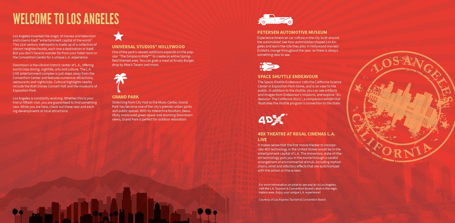
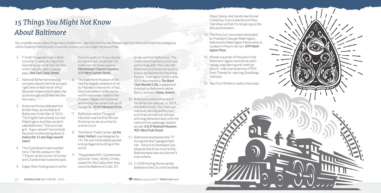
Program Guides
Program guides for the Drupalcons were 48 pages filled with fun facts, company directories, ads, session tracks, schedules, and maps. The program guides were printed and available as PDF.


